5 Green performance
5.1 Theoretical arguments
This section avoids technical details. Theoretical models are reviewed in Chapter 7 of PISEI.
5.1.1 Greenness is detrimental to performance
The simplest theoretical proof that ESG should be costly comes from the paper Sustainable investing in equilibrium - open version here. We simplify the argument here. Let us assume that there is only one representative agent (that’s the simplification) with the utility we’ve seen in the previous chapter, so that the optimal portfolio composition is \(w^*=\gamma^{-1}\Sigma^{-1}(r+\kappa g +\lambda 1_N)\). Then, we can express the expected returns \(r\) as a function of the vector \(g\):
\[\large r = \gamma \Sigma w^*-\lambda 1_N- \kappa g,\] therefore, assuming high \(g\) is good and \(\kappa>0\), returns are decreasing in the ESG scores.
Another argument is the following. Assume there are 100 stocks in your investment universe. For simplicity, let’s say that a screening (removing some sectors, or brown, or low ESG score firms) divides that into 2 (this gives 50 stocks because the other 50 are excluded). Then, the opportunity set shrinks because there is less variety in the cross-section: the universe, financially speaking, is poorer, as there are fewer stocks with above average upside potential and fewer ways to diversify the portfolio and hedge risks.
5.1.2 Greenness is good for performance
This is what everybody loves to hear, but there are reasons why that might actually be the case.
First, some pillars relate to good sense, good management, notably for the Governance dimension. Healthy governance seems intuitively a good thing. Likewise, environmental acumen is probably an advantage in the long run, for several reasons:
- lower exposure to climate uncertainty and weather catastrophes
- lower exposure to transition risk (carbon taxes)
- higher odds of customer engagement (green savvy clients) and hence higher sales, earnings, dividends, etc.
The attention that ESG assets (stocks & funds) have received has led to a lot of money being poured into the field. It is shown in Flow driven ESG returns that a large portion of the good performance of ESG stocks in 2019-2021 is attributable to such flows. Technical Note: the theoretical argument that links demand & price fluctuations has recently been forcefully made in In Search of the Origins of Financial Fluctuations: The Inelastic Markets Hypothesis.
In Dissecting green returns, the authors contend that good green returns are only conjuncture-based as they are explained by increased climate concerns. The overall argument makes sense. But one of its implication is: when climate will no longer be a concern (is it possible?) and/or when people will be less interested in sustainability, green returns will be less competitive (if only because green assets will end up being too expensive). Hence the following section.
5.1.3 It depends
Preferences, demands change all the time. ESG (in its green or brown version) is like any other factor: its returns are sometimes positive, sometimes negative. The loop is the following:
- There is high demand for an asset, hence its price rises;
- Possible extrapolation/momentum (people want assets that have performed well) may further push the price up;
- At some point, the asset becomes too expensive (or less fashionable), hence demand stagnates, then shrinks, which curtails returns;
- Until the asset becomes cheap again and/or appealing to investors for some other reason.
5.1.4 The broad picture from the empirical side
Empirically, the evidence that links durability and financial performance is weak. For a brief overview, we refer to Chapter 4 of PISEI. To summarize, dozens of studies have shown that the link is positive, dozens have proven the opposite. Many come to the more modest and reasonable conclusion that, indeed, “it depends”.
The dimensions are numerous. Performance may depend on:
-
time: this is the most obvious; sometimes green will profit more, sometimes not.
-
geography: combined to chronology is space. In some zones, ESG will fare good, in some other, not so good.
-
pillar: maybe it’s E that matters, maybe it’s S - unless it’s G. It can also be field-specific.
-
industry: what’s a green oil producer? Has durability the same effect on all sectors? Probably not.
-
ownership: if a green firm is owned privately, or by institutional investors, can it change its performance (there are many related questions, typically about alignment of interests, strategies, etc.)
- data provider (see below)
In short: it’s complicated. Moreover, there might be a non-linear link between ESG and returns: high returns may be for sin stocks (very low ESG) and for very virtuous ones (very high ESG), but not for those in the middle. This gives a U-shape:

5.2 Empirical analysis
5.2.1 Part I: US equities
When ESG data at the stock level is available, it is possible to evaluate the returns of green versus brown portfolios. The procedure is simple: sorting. Pick a threshold (quantile) \(q\) smaller or equal to 50%. Then select all the firms with ESG score above \(q\)% and compute their average return. Do the same for all stocks with ESG score below \(q\)%, and compare. One example below that shows how the categorization between green and brown works and evolves throught time:
library(tidyverse)
library(lubridate)
library(kableExtra)
load("ESG_data.RData")
q <- 0.5
ESG_data |>
  filter(year(date) > 2002, year(date) < 2024) |>
  filter(source == "Provider_B") |>
  group_by(date) |>                # This means that all operations will be run date by date, separately
  mutate(type = if_else(esg_metric > quantile(esg_metric, q, na.rm = T), # This creates the sorts...
                        "Green",                                         # ...Green if high ESG...
                        "Brown")) |>                                     # ...Brown if not
  select(name, date, close, esg_metric, type)                            # Select a few columns
## # A tibble: 113,285 × 5
## # Groups: date [252]
## name date close esg_metric type
## <chr> <date> <dbl> <dbl> <chr>
## 1 Agilent Technologies Inc 2003-01-31 11.1 24.6 Brown
## 2 Agilent Technologies Inc 2003-02-28 8.89 24.6 Brown
## 3 Agilent Technologies Inc 2003-03-31 8.86 24.6 Brown
## 4 Agilent Technologies Inc 2003-04-30 10.8 24.6 Brown
## 5 Agilent Technologies Inc 2003-05-31 12.2 24.6 Brown
## 6 Agilent Technologies Inc 2003-06-30 13.2 24.6 Brown
## 7 Agilent Technologies Inc 2003-07-31 14.6 24.6 Brown
## 8 Agilent Technologies Inc 2003-08-31 16.4 24.6 Brown
## 9 Agilent Technologies Inc 2003-09-30 14.9 24.6 Brown
## 10 Agilent Technologies Inc 2003-10-31 16.8 28.5 Green
## # ℹ 113,275 more rowsIn this first example, we observe something rather usual but nonetheless a bit disturbing. A company sees a big spike in its ESG rating. This is a bit suspicious, and allows it to switch from brown to green in the sort. Ok, so now let’s have a look at returns. If a stock has price \(P_t\) at time \(t\), its return over the past period (day, month, year, etc…) is \[r_t=\frac{P_t}{P_{t-1}}-1\]
If \(r_t=0\), it means the price has not changed. A positive \(r_t\) means the stock price has increased.
For instance, if the value was 100€ yesterday, but is 105€ today, the return is +5%. However, if it is 97€ today, then the return in -3%.
In our dataset, the price is the closing price, Close. Hence the formula in the code will be:
\[\text{return = Close/lag(Close) - 1, }\]
because the lag function takes the previous value (of the Close price vector). But of course, this has to be done company-by-company. In data science, this is called grouping.
5.2.1.1 ESG metric
First, we look at sorts based on the synthetic ESG measure.
We start by adding returns to the sorting type.
q <- 0.5
ESG_data |>
  filter(year(date) > 2002, year(date) < 2024) |>
  filter(source == "Provider_B") |>
  group_by(date) |>                # This means that all operations will be run date by date, separately
  mutate(type = if_else(esg_metric > quantile(esg_metric, q, na.rm = T), # This creates the sorts...
                        "Green",                                         # ...Green if high ESG...
                        "Brown")) |>                                     # ...Brown if not
  ungroup() |>
  group_by(name) |>                                                      # Now we group by firm
  mutate(return = close / lag(close) - 1) |>                             # Here we compute the return
  filter(return < 3) |>                                                  # Remove crazy returns
  select(name, date, close, esg_metric, type, return)
## # A tibble: 112,791 × 6
## # Groups: name [494]
## name date close esg_metric type return
## <chr> <date> <dbl> <dbl> <chr> <dbl>
## 1 Agilent Technologies Inc 2003-02-28 8.89 24.6 Brown -0.199
## 2 Agilent Technologies Inc 2003-03-31 8.86 24.6 Brown -0.00379
## 3 Agilent Technologies Inc 2003-04-30 10.8 24.6 Brown 0.218
## 4 Agilent Technologies Inc 2003-05-31 12.2 24.6 Brown 0.132
## 5 Agilent Technologies Inc 2003-06-30 13.2 24.6 Brown 0.0783
## 6 Agilent Technologies Inc 2003-07-31 14.6 24.6 Brown 0.112
## 7 Agilent Technologies Inc 2003-08-31 16.4 24.6 Brown 0.119
## 8 Agilent Technologies Inc 2003-09-30 14.9 24.6 Brown -0.0909
## 9 Agilent Technologies Inc 2003-10-31 16.8 28.5 Green 0.127
## 10 Agilent Technologies Inc 2003-11-30 19.1 28.5 Green 0.135
## # ℹ 112,781 more rows
ESG_data <- ESG_data |>
  group_by(name) |>                                           # Now we group by firm
  mutate(return = close / lag(close) - 1) |>                  # Here we compute the return
  ungroup()
With the same code, we add a pivot table to summarize the average return of each type.
q <- 0.5
ESG_data |>
  filter(year(date) > 2002, year(date) < 2024) |>
  filter(source == "Provider_B", is.finite(esg_metric)) |>    # Keeps non missing ESG fields
  group_by(date) |>                    # All operations will be run date by date, separately
  mutate(type = if_else(esg_metric > quantile(esg_metric, q), # This creates the sorts...
                        "Green",                              # ...Green if high ESG...
                        "Brown")) |>                          # ...Brown if not
  ungroup() |>
  filter(return < 3) |>                                       # Remove crazy returns
  group_by(type) |>
  summarise(avg_return = mean(return, na.rm = T))  |>
kableExtra::kable(caption = 'ESG metric and portfolio performance (q = 0.5) - Provider B')| type | avg_return |
|---|---|
| Brown | 0.0132857 |
| Green | 0.0098768 |
In this sample, brown firms clearly outperform.
Let’s look at Provider A. But remember that in this case, it’s an ESG risk score, so we must inverse the sort.
q <- 0.5
ESG_data |>
  filter(year(date) > 2002, year(date) < 2024) |>
  filter(source == "Provider_A", is.finite(esg_metric)) |>    # Keeps non missing ESG fields
  group_by(date) |>                    # All operations will be run date by date, separately
  mutate(type = if_else(esg_metric < quantile(esg_metric, q), # This creates the sorts...
                        "Green",                              # ...Green if high ESG...
                        "Brown")) |>                          # ...Brown if not
  ungroup() |>
  filter(return < 2) |>                                       # Remove crazy returns!
  group_by(type) |>
  summarise(avg_return = mean(return*12, na.rm = T)) |>
kableExtra::kable(caption = 'ESG metric and portfolio performance (q = 0.5) - Provider A')| type | avg_return |
|---|---|
| Brown | 0.0675525 |
| Green | 0.0581605 |
Same conclusion (though with different returns!), but with a different scale: because returns are sampled monthly! Moreover, the time frame is much shorter, as ESG is only provided from April 2021 onwards here.
5.2.1.2 Scope 3
What if, instead of sorting according to the ESG metric, we created portfolios based on their pollution. But remember, if we take raw emissions, we will have a huge size bias (large firms pollute more). Hence, the metric we use is intensity = emissions / capitalization. Note that the sorting condition is reversed (green = low emission intensity)!
q <- 0.5
ESG_data |>
  filter(year(date) > 2002, year(date) < 2024) |>
  mutate(intensity = scope_3 / market_cap) |>
  filter(source == "Provider_A", is.finite(intensity)) |>     # Keeps non missing ESG fields
  group_by(date) |>                    # All operations will be run date by date, separately
  mutate(type = if_else(intensity < quantile(intensity, q),   # This creates the sorts...
                        "Green",                              # ...Green if high ESG...
                        "Brown")) |>                          # ...Brown if not
  ungroup() |>
  filter(return < 2) |>                                       # Remove crazy returns
  group_by(type) |>
  summarise(avg_return = mean(return*12, na.rm = T) )  |>     # Annualize
kableExtra::kable(caption = 'Scope 3 intensity and portfolio performance (q = 0.5)')| type | avg_return |
|---|---|
| Brown | 0.1083548 |
| Green | 0.1366264 |
How surprising, now the conclusion is reversed! \(\rightarrow\) IT DEPENDS!
5.2.1.3 The impact of the sorting threshold \(q\)
In asset pricing, the purity of factors is also an issue. Up to now, we have only split the firms in two groups, via the 50% threshold. But what happens if we look at sorts that are more pure, e.g., for \(q=0.2\)?

Let’s look at the ESG metric first.
q <- 0.2
ESG_data |>
  filter(year(date) > 2002, year(date) < 2024) |>
  filter(source == "Provider_B") |>
  group_by(date) |>                # This means that all operations will be run date by date, separately
  mutate(type = if_else(esg_metric > quantile(esg_metric, 1-q, na.rm = T),  # This creates the sorts...
                        "Green",                                            # Green if high
                        if_else(esg_metric < quantile(esg_metric, q, na.rm = T),
                                "Brown",                                 # ...Brown if low...
                                "Grey"))) |>                             # ... Grey otherwise
  ungroup() |>
  filter(is.finite(esg_metric), return < 3) |>
  group_by(type) |>
  summarize(avg_return = mean(return*12, na.rm = T))  |>
kableExtra::kable(caption = 'ESG metric and portfolio performance (q = 0.2)')| type | avg_return |
|---|---|
| Brown | 0.1917047 |
| Green | 0.1037442 |
| Grey | 0.1331740 |
Conclusion: Brown > Grey > Green. There is a clear ordering and brown firms clearly dominate.
What about Scope 3 intensities?
q <- 0.2
ESG_data |>
  filter(year(date) > 2002, year(date) < 2024) |>
  mutate(intensity = scope_3 / market_cap) |>
  filter(source == "Provider_A", is.finite(intensity)) |>     # Keeps non missing ESG fields
  group_by(date) |>                    # All operations will be run date by date, separately
  mutate(type = if_else(intensity < quantile(intensity, q),   # This creates the sorts...
                        "Green",                              # ...Green if high ESG...
                        if_else(intensity > quantile(intensity, 1-q),
                                "Brown",
                                "Grey"))) |>                          # ...Brown if not
  ungroup() |>
  group_by(name) |>                                           # Now we group by firm
  mutate(return = close / lag(close) - 1) |>                  # Here we compute the return
  ungroup() |>
  filter(return < 2) |>
  group_by(type) |>
  summarise(avg_return = mean(return, na.rm = T) * 12) |>
kableExtra::kable(caption = 'Scope 3 intensity and portfolio performance (q = 0.2)')| type | avg_return |
|---|---|
| Brown | 0.1020105 |
| Green | 0.1561440 |
| Grey | 0.1273405 |
In this case, the order reverses again.
Note that we could obtain U patterns (or V patterns). This can happen if some investors reward green firms, while others bet on more profitable businesses, like for Sin Stocks.
Such non-linearities are documented in some studies and they also contribute to making the effects harder to discern and the story more complex to tell.
5.2.1.4 ESG and risk
In sustainable investing, there are 3 vertices: return, risk and greenness. Most of the time, it’s the link between return (raw profitability) and ESG that is investigated. The link between return and risk is out of the scope of this course (it is a very old topic!). Here, we are interested in the edge between sustainability and risk.

There are many ways to proceed to assess risk. Below, we will simply consider volatility, i.e., the standard deviation of returns. Also, we compute metrics only for the stocks which have a sufficient number of observations (12 at least).
library(plotly)
g <- ESG_data |>
  filter(year(date) > 2002, year(date) < 2024) |>
  filter(source == "Provider_A") |>
  group_by(name) |>
  mutate(n_ret = sum(is.finite(return)),               # Number of well-defined returns
         n_esg = sum(is.finite(esg_metric))) |>        # Number of well-defined ESG scores
  filter(n_ret > 12, n_esg > 12, return < 2) |>
  summarise(risk = sd(return, na.rm = T),              # Risk
            ESG = mean(esg_metric, na.rm = T)) |>      # Average ESG metric
  ggplot(aes(x = ESG, y = risk, label = name)) + geom_point() +
  theme_bw() + geom_smooth(method = "lm", color = "red")
ggplotly(g)
Remember that for Provider A, the ESG metric is a Risk Score. Hence: the higher the ESG risk, the higher the financial risk! Let’s try the same analysis for Scope 3 intensities.
g <- ESG_data |>
  filter(year(date) > 2002, year(date) < 2024) |>
  filter(source == "Provider_A") |>
  group_by(name) |>
  mutate(intensity = scope_3/market_cap,                # Intensity
         n_ret = sum(is.finite(return)),                # Number of well-defined returns
         n_esg = sum(is.finite(intensity))) |>          # Number of well-defined ESG scores
  filter(n_ret > 12, n_esg > 12, return < 2) |>
  summarise(risk = sd(return*12, na.rm = T),               # Risk
            intensity = mean(intensity, na.rm = T)) |>  # Average ESG metric
  ggplot(aes(x = intensity, y = risk, label = name)) + geom_point() +
  theme_bw() + xlim("Scope 3 intensity") +
  geom_smooth(method = "lm", color = "red") +
  scale_x_log10()
ggplotly(g)NOTE: we have used a log-scale for the \(x\)-axis because intensities have very heavy tails.
In the above graph, there is no particular link between the two variables.
5.2.2 Part II: green versus traditional funds
Below, we compare two Exchange Traded Funds (ETFs, which are tradeable indices):
- one tracks the S&P500 (SPY), which is a traditional equity index, and
- the other is a “green” fund, as defined by MSCI (SUSA).
This material comes from PISEI Chapter 4
First, let’s plot the evolution of values, starting at 1$ in 2005.
library(quantmod)                             # Package for financial data retrieval
library(lubridate)                            # Package for date management
library(tidyquant)
tickers = c("SUSA", "SPY")                    # Ticker names
# prices <- getSymbols(tickers, src = 'yahoo',  # Yahoo source
#                      from = "2005-01-28",
#                      to = Sys.Date(),
#                      auto.assign = TRUE,
#                      warnings = FALSE) %>%
#   map(~Ad(get(.))) %>%
#   reduce(merge)

prices <- tq_get(x = tickers,
                 get  = "stock.prices",
                 from = "2005-01-28",
                 to = Sys.Date())

norm_ <- function(v){return(v/v[1])}
prices <- prices |>
  select(symbol, date, adjusted) |>
  group_by(symbol) |>
  mutate(adjusted = adjusted |> norm_()) |>
  ungroup()
prices |>
  ggplot(aes(x = date, y = adjusted, color = symbol)) + geom_line() + theme_light() +
  scale_color_manual(values = c("#0D70CD", "#0DCD64"), labels = c( "S&P 500", "MSCI ESG")) +
  theme(legend.position = c(0.2, 0.8)) + xlab("Date") + ylab("Index Value") +
theme(text = element_text(size = 16)) 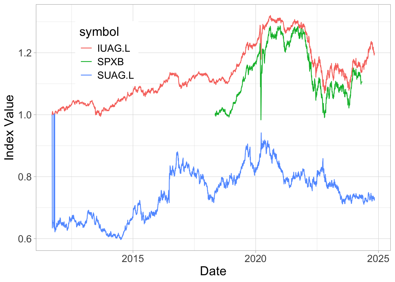
The two curves are relatively close because the green fund is well diversified and has sector and factor exposures that are not too far from those of the S&P500. Basically, it’s likely that the MSCI ESG fund is a very light green fund.
Below, we compute some simple financial indicators for the 2 funds.
returns <- prices |>                                                      # returns
  group_by(symbol) |>
  mutate(return = adjusted / lag(adjusted) - 1) |>
  ungroup() |>
  na.omit()

ret <- returns |> group_by(symbol) |> summarise(m = mean(return)) |> pull(m) # mean return
vol <- returns |> group_by(symbol) |> summarise(s = sd(return)) |> pull(s) # volatility
ratio <- ret/vol                                                             # Sharpe ratio (proxy)

tibble(Index = c("S&P 500", "MSCI ESG"),
       Return = as.numeric(252 * ret) |> round(3),
       Volatility = (sqrt(252)*vol) |> round(3),
       Ratio  = as.numeric(ratio*sqrt(252)) |> round(3)) |>
kableExtra::kable(caption = 'Performance indicators.')| Index | Return | Volatility | Ratio |
|---|---|---|---|
| S&P 500 | 0.121 | 0.191 | 0.637 |
| MSCI ESG | 0.115 | 0.183 | 0.625 |
The differences are small: 11.1% (SUSA) versus 11.7% (SPY), but also a smaller vol for the green index.
All in all, the Sharpe ratios are virtual equal.
What happened during COVID? Let’s start the analysis at the beginning of 2020, right before the start of the pandemic.
prices %>%
  filter(date > "2019-12-31", date < "2021-06-30") %>%
  group_by(symbol) |>
  mutate(adjusted = adjusted |> norm_()) %>%
  ggplot(aes(x = date, y = adjusted, color = symbol)) + geom_line() + theme_light() +
  scale_color_manual(values = c("#0D70CD", "#0DCD64"), labels = c("S&P 500", "MSCI ESG")) +
  theme(legend.position = c(0.75, 0.2)) + xlab("Date") + ylab(element_blank()) +
  theme(text = element_text(size = 14), aspect.ratio = 0.8)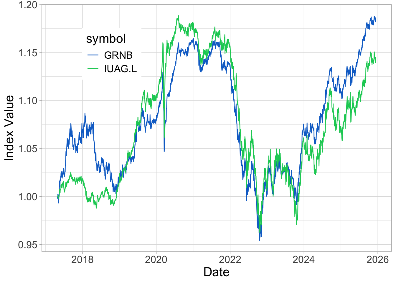
The two funds fell quite sharply, but it was in the recovery period that the green assets performed well. Hence, sustainability was not a hedge during bad times. But after a tough period, maybe people were more interested in well-managed not climate-exposed firms. Because, to many, COVID was a wake-up call:
In terms of annual returns:
returns %>%
  mutate(year = year(date)) %>%
  group_by(year, symbol) %>%
  summarise(avg_return = mean(return)*252) %>%
  ggplot(aes(x = year, y = avg_return, fill = symbol)) + geom_col(position = "dodge")  + theme_light() +
  scale_fill_manual(values = c("#0D70CD", "#0DCD64"), labels = c( "S&P 500", "MSCI ESG")) +
  theme(legend.position = c(0.45, 0.2)) + xlab(element_blank()) + ylab("Annualized Return") +
theme(text = element_text(size = 14)) 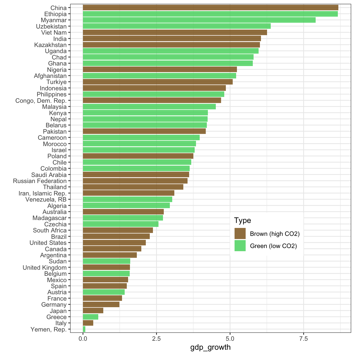
Like we have mentioned, the recent years (2019-2021) have been very good for sustainable equities…
5.2.3 Part III: bonds
Bonds are very hard to analyze because they have a maturity, i.e., a point in time when the product ceases to exist.
This make computations very cumbersome.
To ease the burden, we will work with bond indices below.
We start by fetching data for two green bond indices, namely:
- BGRN: iShares USD Green Bond ETF
- GRNB: VanEck Green Bond ETF
An important feature is that the second index “seeks to replicate, as closely as possible, before fees and expenses, the price and yield performance of the S&P Green Bond U.S. Dollar Select Index (SPGRUSST). The index is comprised of U.S. dollar-denominated green bonds that are issued to finance environmentally friendly projects, and includes bonds issued by supranational, government, and corporate issuers globally.”
library(quantmod)                             # Package for financial data retrieval
tickers = c("BGRN", "GRNB")                   # Ticker names
prices <- tq_get(x = tickers,
                 get  = "stock.prices",
                 from = "2005-01-28",
                 to = Sys.Date())
prices <- prices |>
  select(symbol, date, adjusted) |>
  group_by(symbol) |>
  mutate(adjusted = adjusted |> norm_()) |>
  ungroup()
prices |>
  ggplot(aes(x = date, y = adjusted, color = symbol)) + geom_line() + theme_light() +
  scale_color_manual(values = c("#0DCD64",  "#0D70CD"), labels = c("iShares_green", "VanEck_green")) +
  theme(legend.position = c(0.2, 0.8)) + xlab("Date") + ylab("Index Value") +
theme(text = element_text(size = 16)) 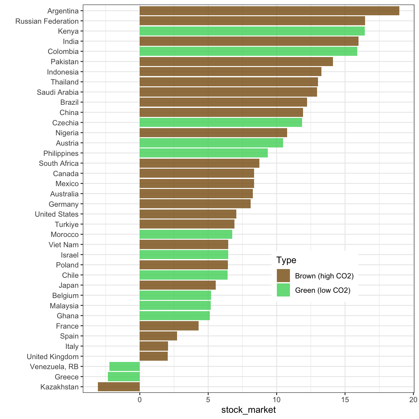
Roughly speaking, we see that the patterns are very similar between the two indices.
To further simplify the task, we will only focus on one only, and the best choices is probably that with the longest price history (i.e., VanEck).
Now, let’s turn to the traditional bond indices.
-
IUAG.L: iShares US Aggregate Bond UCITS ETF USD
-
SUAG.L: iShares US Aggregate Bond UCITS ETF USD
- SPXB: ProShares S&P 500 Bond ETF
tickers <- c("IUAG.L", "SUAG.L", "SPXB")
prices <- tq_get(x = tickers,
                 get  = "stock.prices",
                 from = "2005-01-28",
                 to = Sys.Date())
prices <- prices |>
  select(symbol, date, adjusted) |>
  group_by(symbol) |>
  mutate(adjusted = adjusted |> norm_()) |>
  ungroup()
prices |>
  ggplot(aes(x = date, y = adjusted, color = symbol)) + geom_line() + theme_light() +
  theme(legend.position = c(0.2, 0.8)) + xlab("Date") + ylab("Index Value") +
theme(text = element_text(size = 16)) 
Two have similar curves (IUAG and SPXB), the other one seems more exotic. Hence, we’ll stick with the first two but keep only the one with longest history (IUAG).
Let’s first compare the time-series.
tickers = c("IUAG.L", "GRNB")                   # Ticker names
prices <- tq_get(x = tickers,
                 get  = "stock.prices",
                 from = "2017-04-28",
                 to = Sys.Date())
prices <- prices |>
  select(symbol, date, adjusted) |>
  group_by(symbol) |>
  mutate(adjusted = adjusted |> norm_()) |>
  ungroup()
prices |>
  ggplot(aes(x = date, y = adjusted, color = symbol)) + geom_line() + theme_light() +
  theme(legend.position = c(0.2, 0.8)) + xlab("Date") + ylab("Index Value") +
  theme(text = element_text(size = 16))  +
  scale_color_manual(values = c("#0D70CD", "#0DCD64"))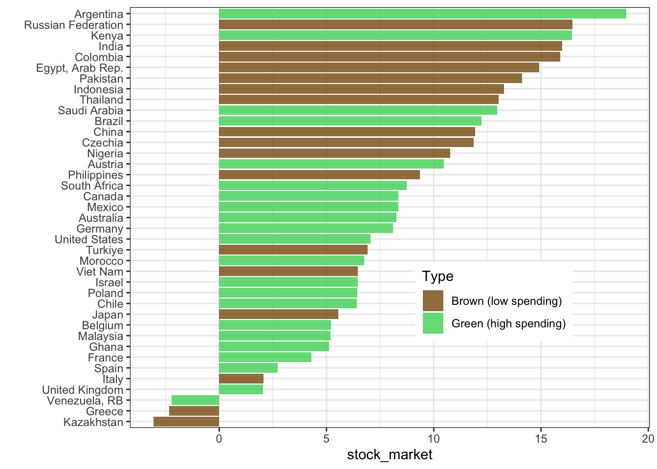
Overall, the performance is not great (the final points are barely above the starting level). But it’s even worse for the traditional bond index… no need to compute returns here: we know in advance that they will not look good.
Therefore, with a simple exercise (and only one: let us not rush to conclusions!), we see that the sustainable instrument outperforms the traditional one. Again, this is only one example, but it illustrates that greenness is not always followed by a sacrifice in profits (though here… the return is negative!)
5.2.4 Other asset classes?
Beyond equities and bonds, it is natural to look for green assets within other classes, such as commodities, real estate, FX, art, wine, crypto, etc. For FX, it is possible to link sustainability to sovereign ratings (see below). For the other classes, it’s not obvious. It all boils down to data! We can only allocate according to ESG metrics if we have them. For instance, in real estate, this can be the annual energy consumption level (per square meter) of a building.
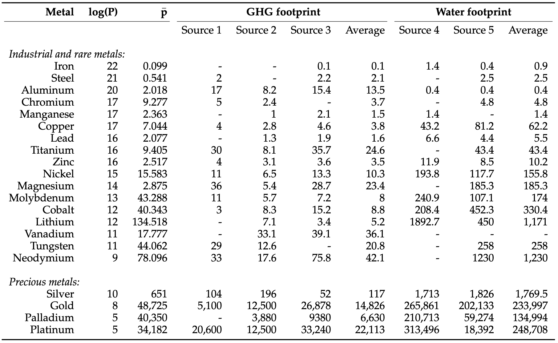
For commodities, it is feasible to assess the amount of GHG required for some activities (crop, metals). In the case of metals, the paper ESG Comes to Town gives some estimates:
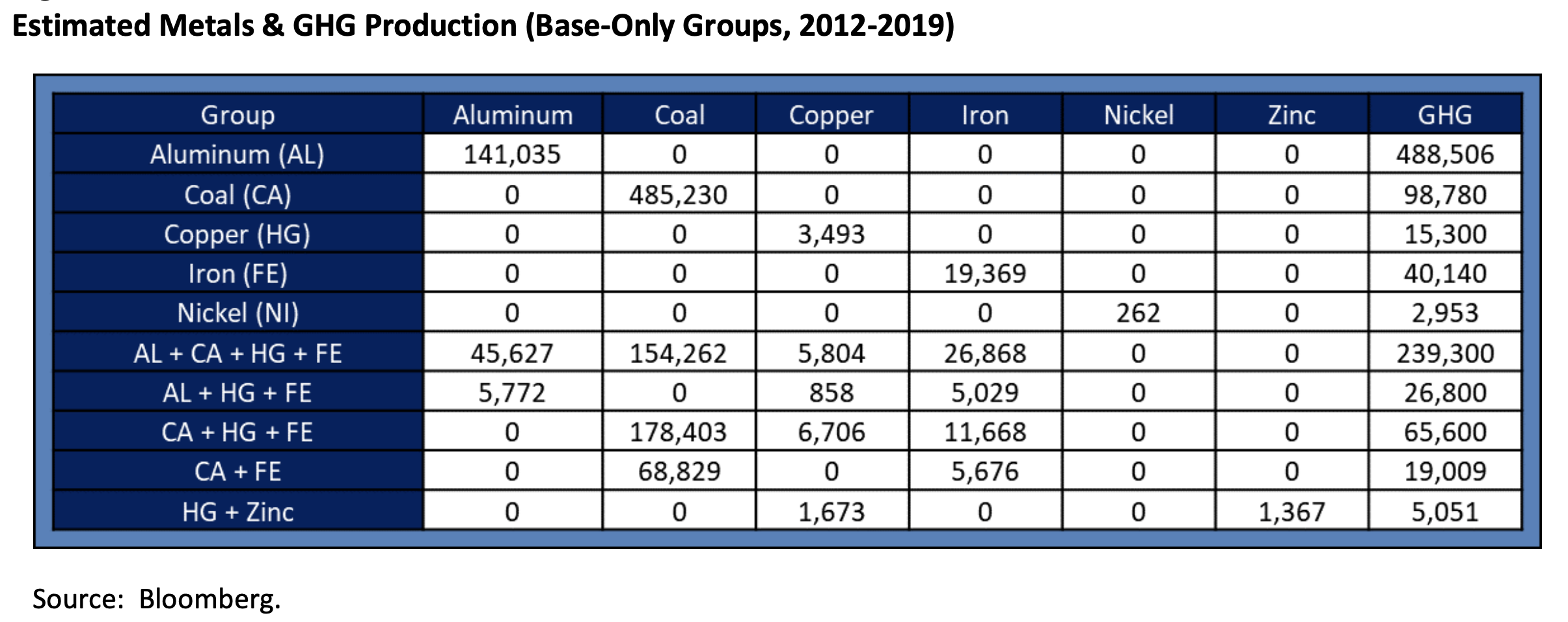
Of course, they have to be scaled by the amount of metal produced.
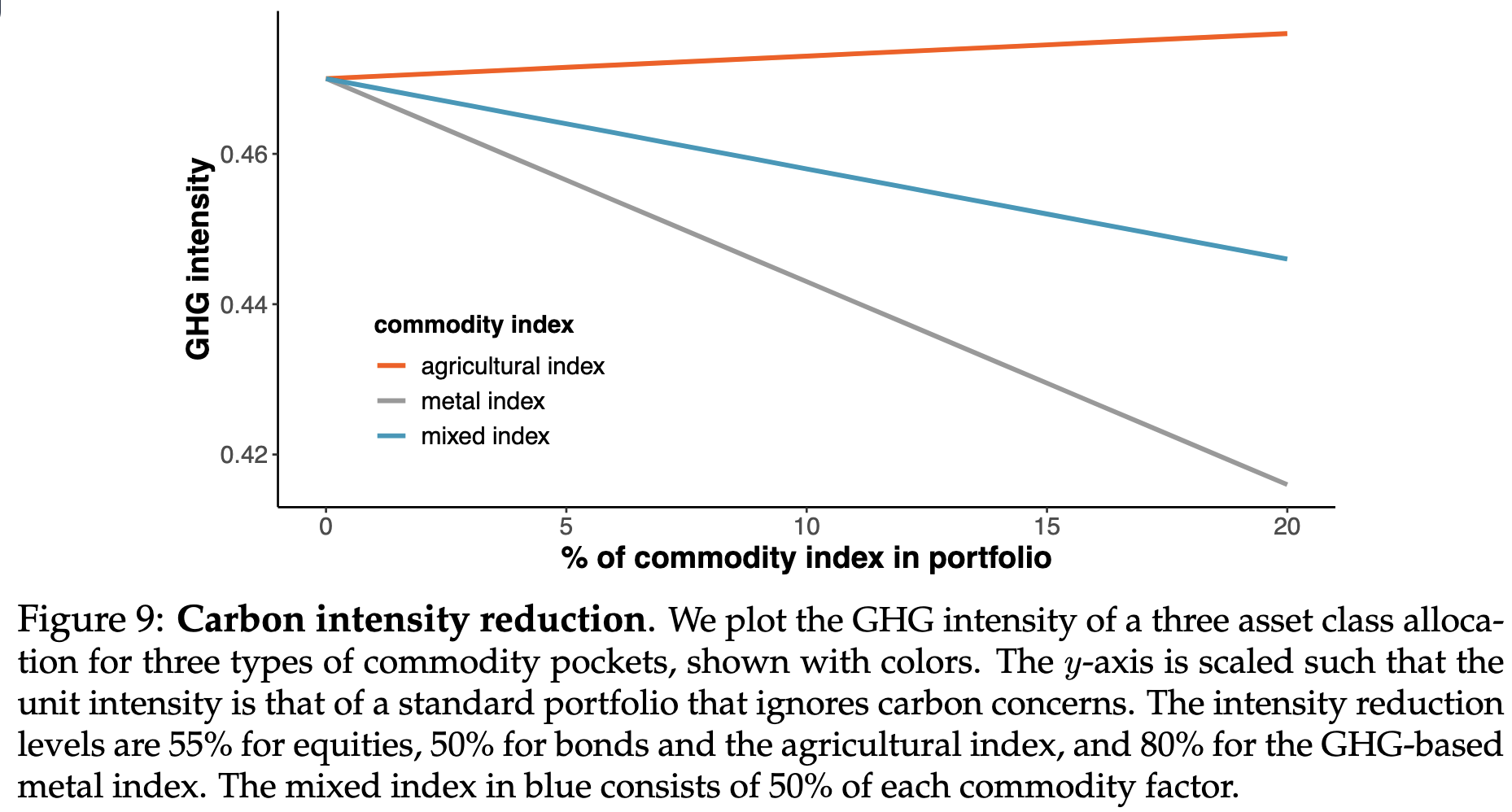
We refer to the paper Sustainability in commodity markets for more on the matter:
The impact for investors willing to decarbonize:
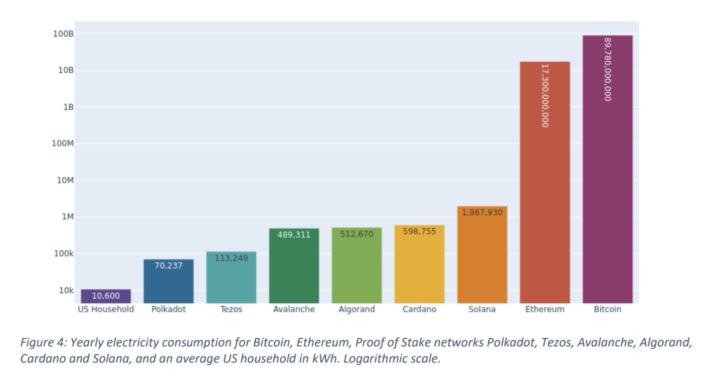
For cryptocurrencies, it is possible to evaluate the amount of energy each chain requires. To measure efficiency, it would be preferable to divide total consumption by some proxy of the size of the chain, either in its actual size (e.g., in Go), or market capitalization for example. For some currencies, estimates are available:
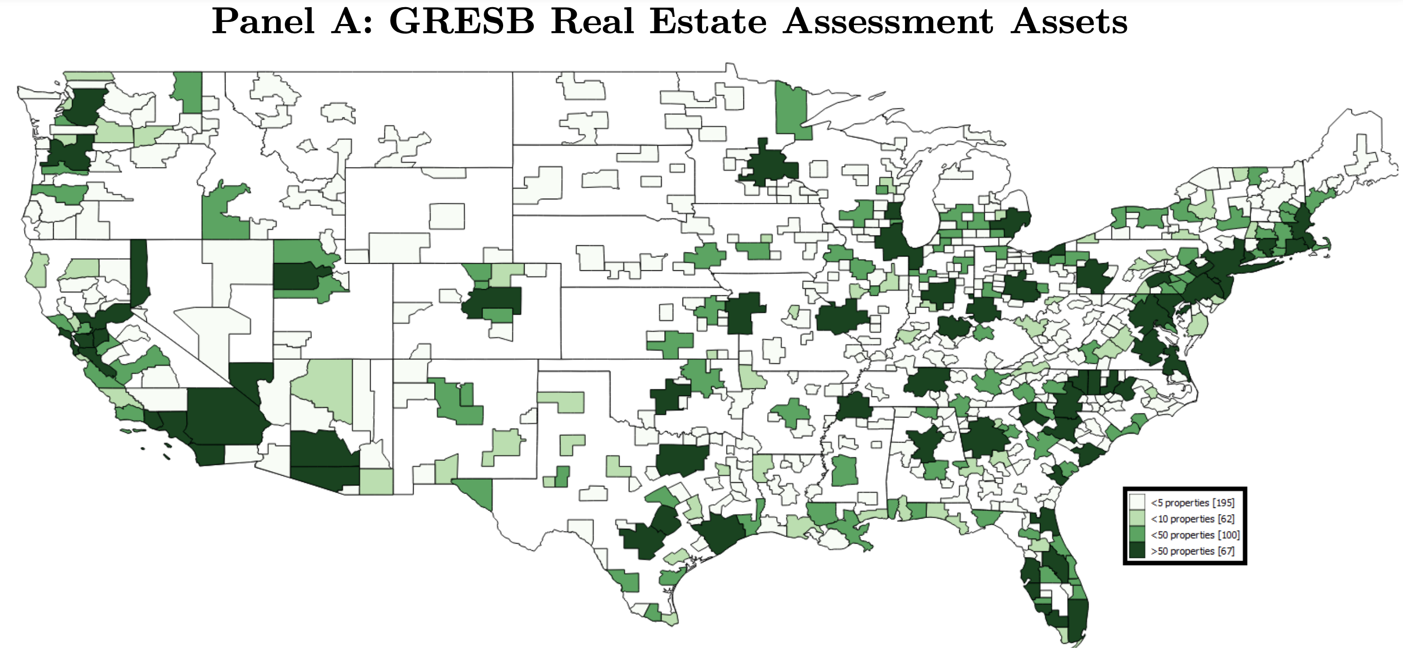
Lastly: real estate. In terms of rating, the Global Real Estate Sustainability Benchmark (GRESB) is an important standard. The GRESB has a methodology that evaluates buildings on key indicators, such as energy consumption, GHG emissions, water consumption (+ recycling, re-use, capture, extraction), waste generation. Other fields include stakeholder engagement (employee security, training, satisfaction survey), supplier evaluation, building materials and certifications.
On the regulation side, we have in Europe the Energy Performance of Buildings Directive (EPBD): “As of 2021, all new buildings must be nearly zero-energy buildings (NZEB) and since 2019, all new public buildings should be NZEB.”
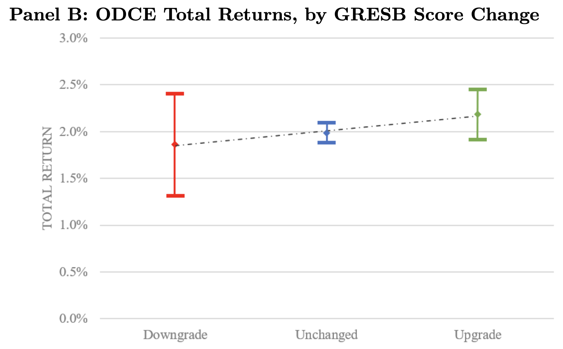
The paper Sustainability and Private Equity Real Estate Returns shows the density of properties with GRESB ratings
In the same paper, the authors show that fund with GRESB score upgrades fare better than those with downgrades.
See also: The Low-Carbon Rent Premium of Residential Buildings.
5.3 A look at sovereign data
The question now is: is sustainability (in some sense) at the country level linked to some form of performance, either in terms of GDP, currency or equity market performance?
To answer this question, we must download the data! We recycle some code (with a different set of variables)…
library(WDI)                          # Package that accesses World Bank data
library(leaflet)                      # Package for maps
country_list <- c("AF", "AR", "AT", "AU", "BE", "BR", "BY", "CA", "CD", "CL",
                  "CM", "CN", "CO", "CZ", "DE", "DZ", "EG", "ES", "ET", "FR",
                  "GB", "GH", "GR", "ID", "IL", "IN", "IQ", "IR", "IT", "JP",
                  "KE", "KZ", "LY", "MA", "MG", "MM", "MX", "MY", "NG", "NP",
                  "PH", "PK", "PL", "RU", "SA", "SD", "TD", "TH", "TR",
                  "TW", "UG", "US", "UZ", "VE", "VN", "YE", "ZA")
wb_data <- WDI(                                              # World Bank data
  indicator = c("ghg_percap" = "EN.GHG.ALL.LU.MT.CE.AR5",  # Emissions per capita
                "corrupt_control" = "CC.EST",              # Corruption control
                "educ_spend" = "SE.XPD.TOTL.GD.ZS",        # Government expenditure on education (%GDP)
                "gdp" = "NY.GDP.MKTP.CD",                  # Gross Domestic Product (GDP)
                "gdp_growth" = "NY.GDP.MKTP.KD.ZG",        # Annual GDP growth
                "stock_market" = "CM.MKT.INDX.ZG"),        # Local S&P index performance
  country = country_list,                                  # Zones: US, France, etc.
  start = 2000,
  end = 2023)
wb_data |> head(19)| country | iso2c | iso3c | year | ghg_percap | corrupt_control | educ_spend | gdp | gdp_growth | stock_market |
|---|---|---|---|---|---|---|---|---|---|
| Afghanistan | AF | AFG | 2000 | 24.91 | -1.27 | NA | 3521418060 | NA | NA |
| Afghanistan | AF | AFG | 2001 | 23.17 | NA | NA | 2813571754 | -9.43 | NA |
| Afghanistan | AF | AFG | 2002 | 25.77 | -1.25 | NA | 3825701439 | 28.60 | NA |
| Afghanistan | AF | AFG | 2003 | 26.40 | -1.34 | NA | 4520946819 | 8.83 | NA |
| Afghanistan | AF | AFG | 2004 | 26.54 | -1.35 | NA | 5224896719 | 1.41 | NA |
| Afghanistan | AF | AFG | 2005 | 26.69 | -1.45 | NA | 6203256539 | 11.23 | NA |
| Afghanistan | AF | AFG | 2006 | 26.88 | -1.45 | NA | 6971758282 | 5.36 | NA |
| Afghanistan | AF | AFG | 2007 | 28.06 | -1.61 | NA | 9747886187 | 13.83 | NA |
| Afghanistan | AF | AFG | 2008 | 31.41 | -1.67 | NA | 10109297048 | 3.92 | NA |
| Afghanistan | AF | AFG | 2009 | 34.41 | -1.55 | NA | 12416152732 | 21.39 | NA |
| Afghanistan | AF | AFG | 2010 | 38.31 | -1.65 | 3.48 | 15856668556 | 14.36 | NA |
| Afghanistan | AF | AFG | 2011 | 42.44 | -1.60 | 3.46 | 17805098206 | 0.43 | NA |
| Afghanistan | AF | AFG | 2012 | 40.31 | -1.43 | 2.60 | 19907329778 | 12.75 | NA |
| Afghanistan | AF | AFG | 2013 | 38.68 | -1.45 | 3.45 | 20146416758 | 5.60 | NA |
| Afghanistan | AF | AFG | 2014 | 38.90 | -1.36 | 3.70 | 20497128556 | 2.72 | NA |
| Afghanistan | AF | AFG | 2015 | 38.64 | -1.35 | 3.26 | 19134221645 | 1.45 | NA |
| Afghanistan | AF | AFG | 2016 | 37.71 | -1.54 | 4.54 | 18116572395 | 2.26 | NA |
| Afghanistan | AF | AFG | 2017 | 41.02 | -1.53 | 4.34 | 18753456498 | 2.65 | NA |
| Afghanistan | AF | AFG | 2018 | 42.48 | -1.50 | NA | 18053222687 | 1.19 | NA |
5.3.1 CO2 intensity
Now, let’s have a look at emissions. Note: we use CO2 emissions per capita, which is an intensity!
wb_data |>
  group_by(year) |>
  mutate(Type = if_else(ghg_percap <  median(ghg_percap, na.rm = T),
                        "Green",
                        "Brown")) |>
  ungroup() |>
  filter(!is.na(Type)) |>
  group_by(Type) |>
  summarize(gdp_growth = mean(gdp_growth, na.rm = T),
market_return = mean(stock_market, na.rm = T))| Type | gdp_growth | market_return |
|---|---|---|
| Brown | 3.34 | 8.67 |
| Green | 3.70 | 5.48 |
Green outperforms for both criteria! In more detail, for GDP growth:
wb_data |>
  group_by(country) |>
  mutate(ghg_percap = mean(ghg_percap, na.rm = T)) |>
  ungroup() |>
  mutate(Type = if_else(ghg_percap <  median(ghg_percap, na.rm = T),
                        "Green (low CO2)",
                        "Brown (high CO2)")) |>
  ungroup() |>
  filter(!is.na(Type)) |>
  group_by(Type, country) |>
  summarize(gdp_growth = mean(gdp_growth, na.rm = T)) |>
  ggplot(aes(x = gdp_growth, y = reorder(country, gdp_growth), fill = Type)) + geom_col(alpha = 0.8) +
  ylab("") + theme_bw() + theme(legend.position = c(0.7,0.3)) +
  scale_fill_manual(values = c("#875A0F", "#49D366"))
And for market returns (data is missing for some countries):
wb_data |>
  group_by(country) |>
  mutate(ghg_percap = mean(ghg_percap, na.rm = T)) |>
  ungroup() |>
  mutate(Type = if_else(ghg_percap <  median(ghg_percap, na.rm = T),
                        "Green (low CO2)",
                        "Brown (high CO2)")) |>
  ungroup() |>
  filter(!is.na(Type), !is.na(stock_market)) |>
  group_by(Type, country) |>
  summarize(stock_market = mean(stock_market, na.rm = T)) |>
  ggplot(aes(x = stock_market, y = reorder(country, stock_market), fill = Type)) + geom_col(alpha = 0.8) +
  ylab("") + theme_bw() + theme(legend.position = c(0.7,0.3)) +
  scale_fill_manual(values = c("#875A0F", "#49D366"))
To be more accurate, we could split the analysis depending on the geography or level of development of countries. This is left for future work (individual project?)
5.3.2 Education spending
(as % of GDP)
wb_data |>
  group_by(year) |>
  mutate(Type = if_else(educ_spend >  median(educ_spend, na.rm = T),
                        "Green",
                        "Brown")) |>
  ungroup() |>
  filter(!is.na(Type)) |>
  group_by(Type) |>
  summarize(gdp_growth = mean(gdp_growth, na.rm = T),
market_return = mean(stock_market, na.rm = T))| Type | gdp_growth | market_return |
|---|---|---|
| Brown | 4.00 | 7.83 |
| Green | 3.09 | 7.67 |
Here, results are disappointing! Why?
And in details for returns:
wb_data |>
  group_by(country) |>
  mutate(educ_spend = mean(educ_spend, na.rm = T)) |>
  ungroup() |>
  mutate(Type = if_else(educ_spend >  median(educ_spend, na.rm = T),
                        "Green (high spending)",
                        "Brown (low spending)")) |>
  ungroup() |>
  filter(!is.na(Type), !is.na(stock_market)) |>
  group_by(Type, country) |>
  summarize(stock_market = mean(stock_market, na.rm = T)) |>
  ggplot(aes(x = stock_market, y = reorder(country, stock_market), fill = Type)) + geom_col(alpha = 0.8) +
  ylab("") + theme_bw() + theme(legend.position = c(0.7,0.3)) +
  scale_fill_manual(values = c("#875A0F", "#49D366"))
5.4 Conclusion
IT DEPENDS!
There is no clear or obvious link between greenness and risk or performance.
Sometimes ESG solutions do better, sometimes not.
To be able to understand when that happens is a important challenge.
5.5 Exercises
Using the (excel) file for the course.
- Pick a data provider, a date and an ESG criterion (e.g.: emissions, intensities, ESG metric). Based on this criterion, determine which firms are green versus brown. Compute the total market capitalization of green and brown firms. Then: try another date and/or another criterion.
- Pick a data provider and an ESG criterion. On the whole sample and for all firms, compute the full return (over all dates) and the average value of the criterion. For each firms, this gives two values for each firm: the return and the average ESG score. What is the correlation between the two? You can use a scatter plot (x = return, y = ESG score) to illustrate the link (or absence thereof).